Plots
A plot charts a question that is already in your seed data — age, region, a behaviour, an attitude. It shows how the people in an audience actually answered, as a bar chart. It is not a prediction, and it does not carry a confidence grade.
Use a plot when you want to see who is in the data, compare audiences on something you already know about them, or click answers to save a new audience. To ask something that isn't in the seed data, use Surveys.
Creating a plot
- Click Plot in the toolbar at the bottom of a study
- Under Audiences, choose who to plot — up to five, including All of <dataset> as a baseline
- Under Survey question, pick the seed question. Search if the list is long
- Optionally add a Breakdown — a second seed question that splits each bar
- Click Generate plot
The result lands on a card in the study feed, colour-coded by audience.
You can also ask the agent to plot a question in your own words. The same card appears on the study.
The Data page for a dataset shows every seed question by theme in one place. Plot is how you put one of those questions onto a study.
Plots vs surveys
Plot reads a question the audience has already answered. The numbers are counts from the seed data.
Survey asks a new question. Merlin predicts how the audience would answer, and grades how much weight to put on it.
If you can already see the answer in the dataset, plot it. If you need a view the data doesn't carry — a new product, a new line, a price — survey it.
Breakdowns
A breakdown layers a second seed question on the same chart, so you can cut one answer by another — for example age broken down by whether people stream music. Pick the breakdown question and the answer options you want, up to eight.
A plot with a breakdown is for reading, not for building an audience: you can't click bars to save a group while a breakdown is applied.
Creating an audience from a plot
Click the answers you want on the chart. The Audience explorer opens on the right, showing the selection and how many respondents match. Click Save audience.
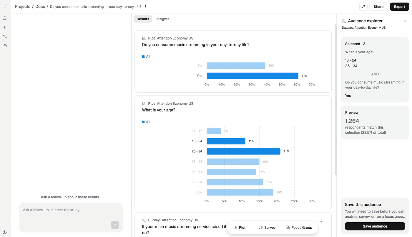
Two plots, one selection. Age 18–34 AND streams music — 1,264 respondents, 23.5% of the dataset.
Selections combine across plots with AND. Click “18 - 24” and “25 - 34” on an age plot, then “Yes” on a music streaming plot, and you get everyone aged 18 to 34 who streams music.
See Audiences for the other ways to define a group.
Comparing audiences
Select up to five audiences in the plot dialog, and include the whole population as a baseline. The card colours each group, the same way a survey comparison does.
Chart type and export
The … menu on a plot card lets you change how the result is drawn, and export that one result as CSV or PNG, or copy it.
Next
- Audiences — save groups from the answers you click
- Surveys — ask questions not in your data
- Audience analysis — what makes a saved audience distinctive